I believe, where there is a company, there has to be a visual presentation – a logo! It has been daunting me that I haven’t had one yet, this was in the 1st week of registering the company :-). In a casual conversation with the kids, I said we should come-up with a logo based on the company name, “Honeybee” of course!
Soon enough, my daughter came up with this concept diagram…
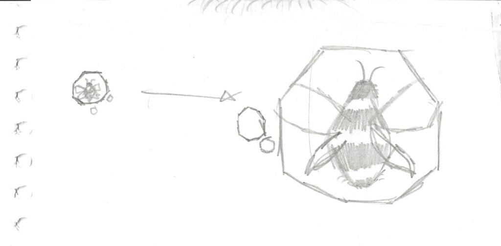
I thought “wow!” – what a lovely hand-drawn image of a honeybee residing inside a honeycomb cell and a couple of smaller honeycomb cells. It kind of started to settle in me and that’s when I thought I could produce a digital version of it.
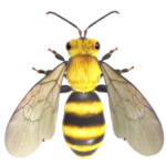
Found a few pictures on the Internet and one stood out very close to what she had drawn, so took that and edited heavily using Paint.net, which resulted in this…
Sent to all in the family. Wife said, “Looks nice” – supporting everything I do all the time – blessed. What did my daughter say? “I think it is very good! ![]() ” – certainly what else she would have said as it is exactly what she had drawn. But, I’ve no idea why that “lol” emoticon though :-).
” – certainly what else she would have said as it is exactly what she had drawn. But, I’ve no idea why that “lol” emoticon though :-).
Son said, “Looks good. But, I don’t like the bee. Maybe more animated” – which kind of reflected my thoughts because I wasn’t 100% convinced with my production of my daughter’s concept diagram. He explained that, ” the bee is ‘too complex‘ and if it is possible to simplify and made it to look modern – it will be really good”.
Then I found this beautiful 3D image in Microsoft 3D Viewer app, but again this wouldn’t satisfy my son’s view – nor mine as this is too complex too.
Thought I could try and simplify this, so tried to make one based on what we made as above and some Internet images – this time in vectr.com and it looked too amateurish. Although vectr.com had the tools to make beautiful scalable vector diagrams, I didn’t have time and patience to create what was hiding in my mind. That’s when Ranjan in Integra Global came to my mind as I’ve seen him creating some beautiful graphics.
I didn’t want to influence him in any way, positive or negative, so just sent him my daughter’s concept diagram and my words to him was, “can you please let me know if you can design an eye-catching modern, but simple logo”.
In just a few hours, he produced not just 1, not 2 but 3 versions as below:
Version 1:
Version 2:
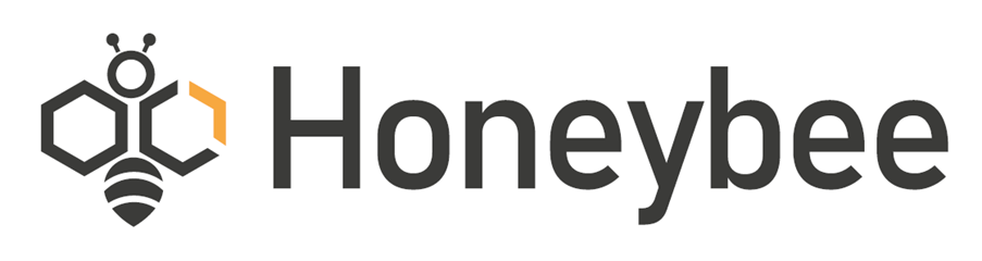
Version 3:
Considering the time difference between the UK and India, these were produced in a magical turnaround time.
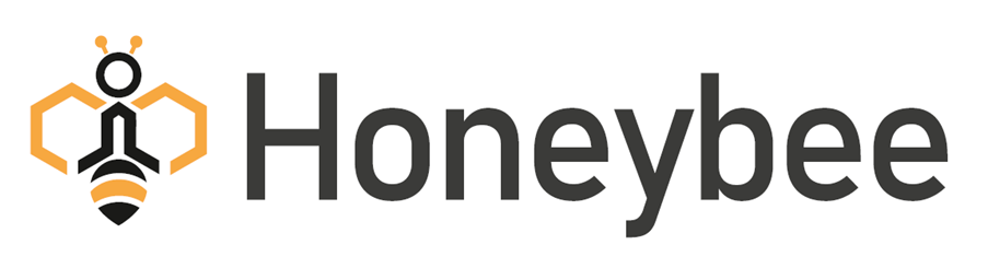
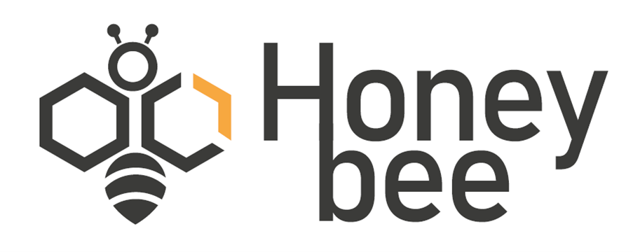
When shown to the family, every one reflected my thoughts and unanimously chosen the image from version 1 and text from the version 3, which was communicated to Ranjan and within few minures our logo was born and here it is…
Much satisfied, everyone in the family is happy too. There’s nothing in the logo that says this is a software company, so there is some work to do!